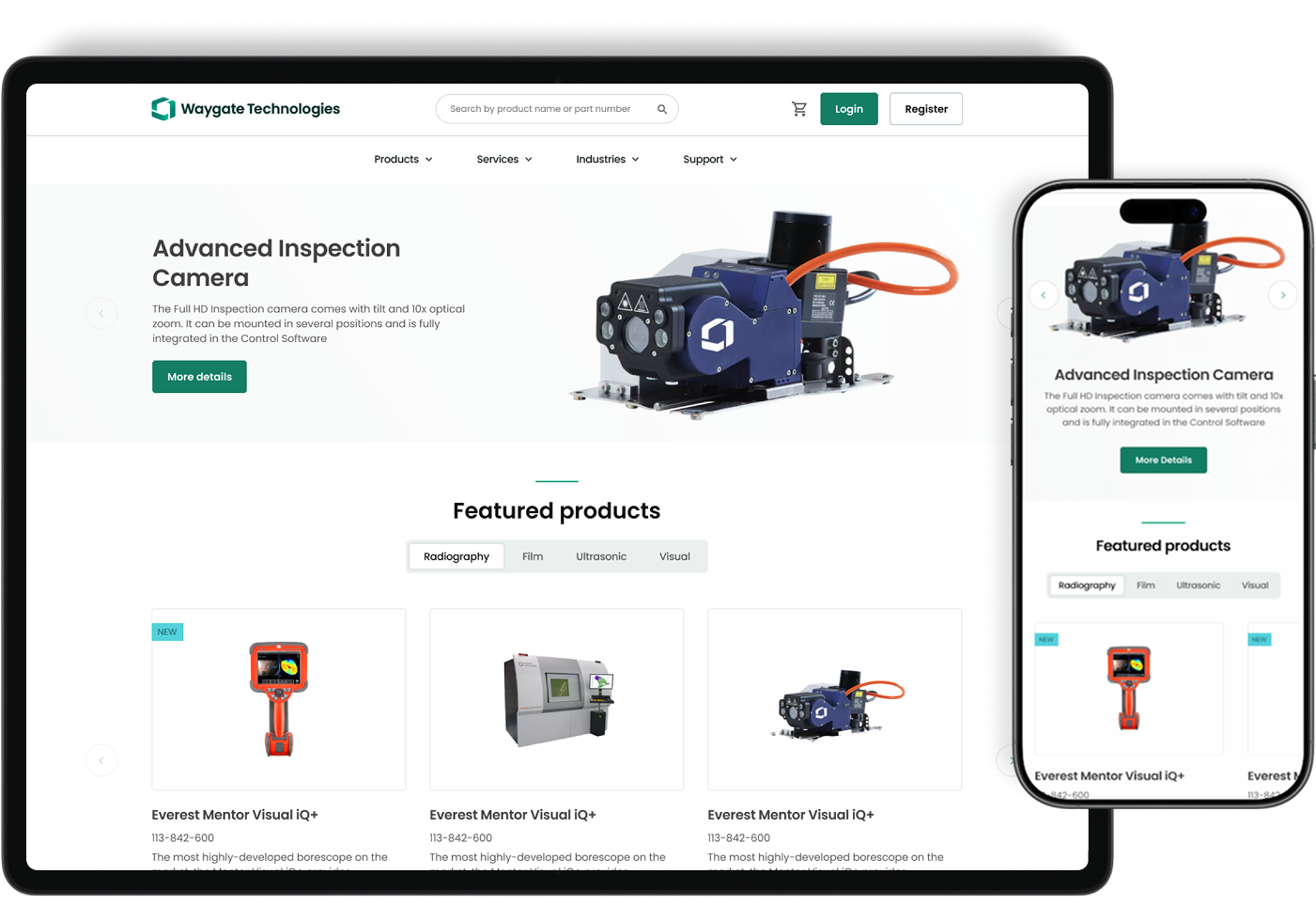
A research-led redesign across five product lines, helping customers find, configure and order specialist equipment with less effort.
Role
Lead UX Designer
Period
2024–2025
Scope
Discovery to delivery
At a glance
A multi-brand commerce transformation for industrial customers who needed clearer product discovery, configuration, purchasing and order visibility.
Problem
Customers moved between the portal, emails, phone calls and manual purchase-order processes to complete routine buying tasks. Inconsistent product structures and limited visibility reduced confidence and placed avoidable pressure on support and sales teams.
My contribution
I led UX discovery, mapped customer pain points and designed and tested the core product discovery and purchasing journeys. I worked with product, engineering and commercial stakeholders to align decisions with technical constraints and deliver a more coherent buying experience.
What made it complex
Five product lines with different commercial rules
Channel partners and direct customers with distinct needs
CPQ, CRM, inventory and order dependencies
Global stakeholders, legacy workflows and accessibility requirements
Problem → response → value
Industrial eCommerce: product decisions and customer outcomes
Customers buying specialist equipment needed clarity at every stage—not just a shorter checkout.
User / team problem
Why it mattered
Design response
Value / evidence
Finding the right specialist product
Fragmented catalogues and unfamiliar product terminology made discovery slow.
Reworked navigation, information hierarchy and product discovery around buying tasks.
Faster product discovery; the case study reports 32% faster search.
Deciding with incomplete information
Pricing, availability and delivery details were not visible when buyers needed them.
Surfaced decision-critical information and clearer product context before checkout.
More confident purchasing decisions; confirm the independent measure before claiming a specific uplift.
Completing complex purchases
Technical configurations, account rules and multiple steps created friction.
Simplified the purchase journey into a guided five-step checkout with clearer progression.
The portfolio reports 54% faster checkout.
Tracking orders after purchase
Customers relied on emails and support teams for order status.
Designed item-level order visibility and self-service status interactions.
The portfolio reports 43% fewer order-status enquiries.
Managing repeat orders
Returning customers had to switch between orders, quotes and service activities.
Brought related signed-in activities into a more coherent account experience.
Less navigation and improved self-service; qualitative benefit.
Handling payment constraints
Different commercial rules restricted available payment methods.
Collaborated with product and commercial stakeholders on card payment within agreed limits.
Reduced purchasing friction without bypassing business rules.
Measurable outcomes
Impact at a glance.
Customer, delivery and commercial outcomes from the redesigned experience.
68%increase in online sales
54%reduction in checkout time
32%faster product search
43%fewer order-status enquiries
Detailed case study
Context
One marketplace, five product lines and several ways of buying.
Customers faced inconsistent navigation, deep product hierarchies and heavy reliance on manual support.
Different sales rules and product configurations across brands.
Channel partners and direct customers with different needs.
Limited visibility of pricing, availability and order status.
Legacy workflows tied to purchase orders and support teams.
Approach
A flexible path from ambiguity to delivery.
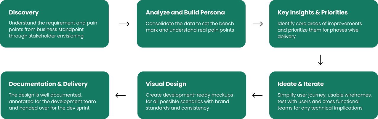
I adapted the process to the problem: align stakeholders, understand customers, simplify the architecture, test early and deliver through the shared design system.
Research
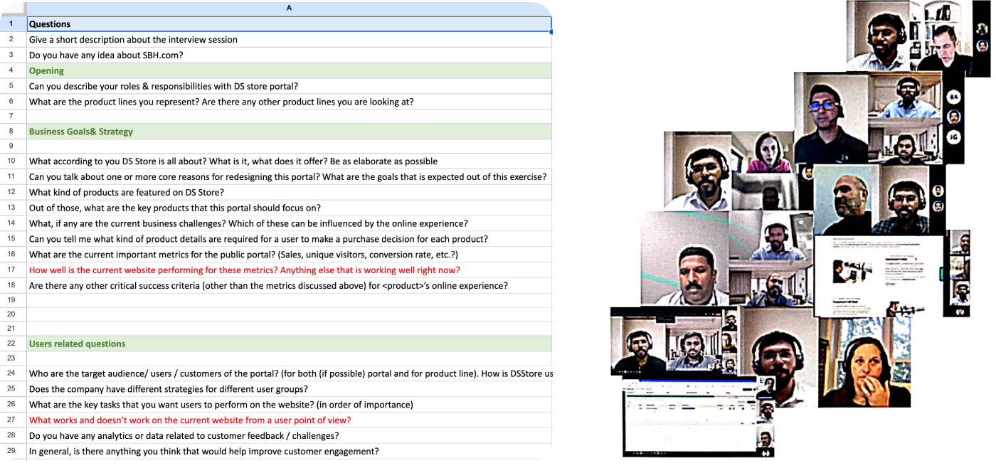
Structured conversations across the business.
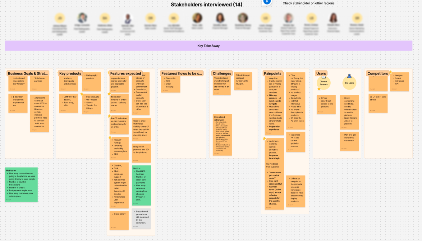
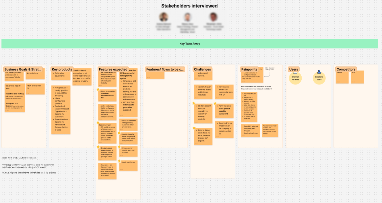
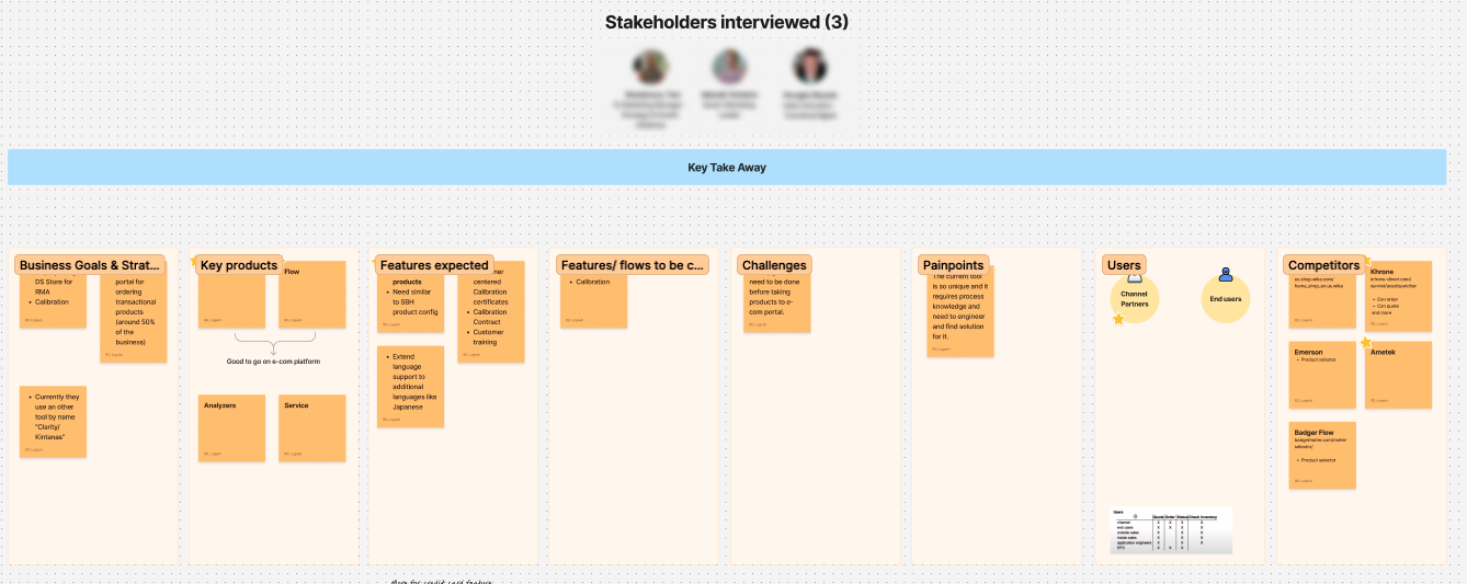
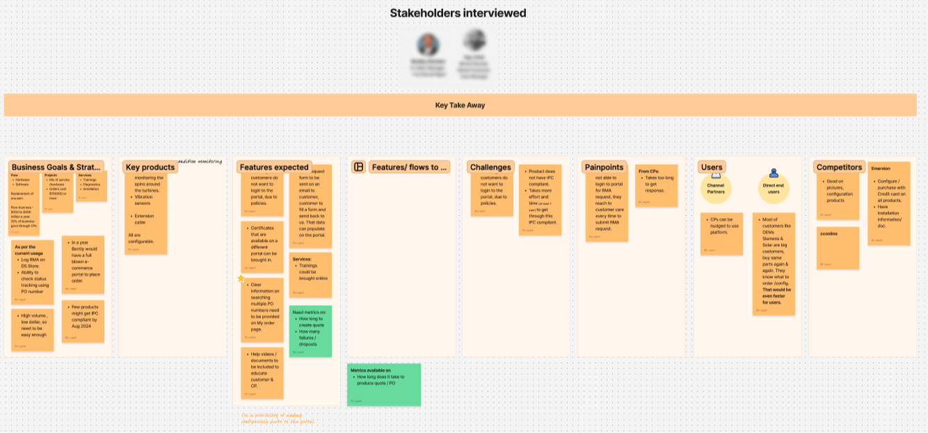
I prepared a focused interview framework and ran 22 sessions with 26 people across sales, marketing, customer care, channel management and product teams.
Stakeholder synthesis across business goals, products, users and pain points.Insights from a second product line highlighted different operational constraints.Cross-product synthesis made common needs and exceptions visible.The final board helped align priorities across teams.
People
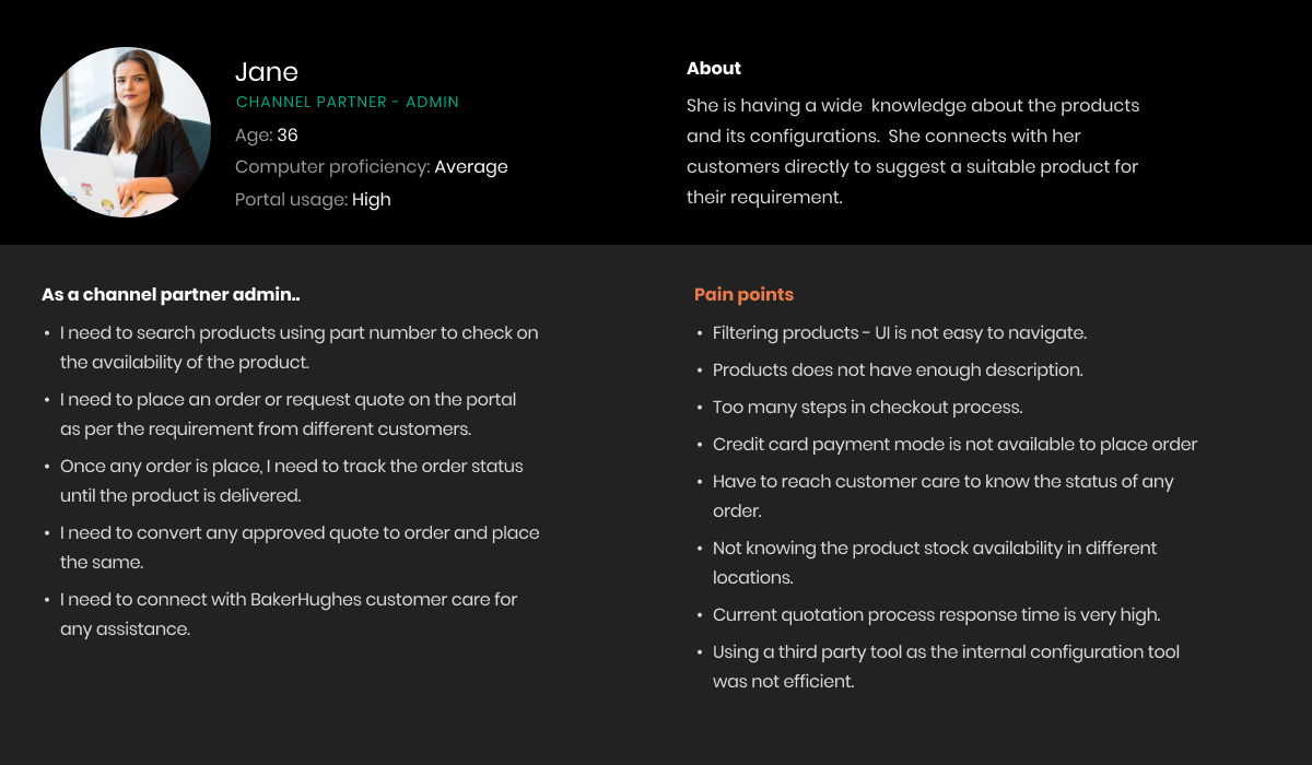
Channel partners shaped the primary experience.
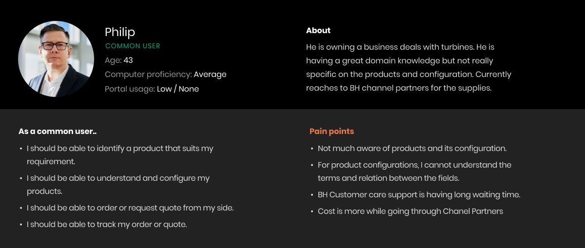
Around 90% of portal users were channel partners. This persona kept the design grounded in repeat ordering, availability checks and customer servicing needs.
People
Direct users needed more guidance.
Direct customers had strong domain knowledge but less familiarity with product configuration and portal terminology.
Priorities
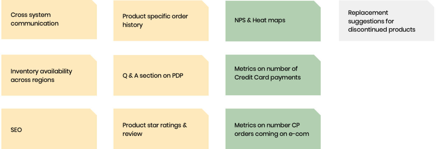
Turn research into a practical opportunity backlog.
The synthesis identified improvements across inventory visibility, product history, reviews, metrics and cross-system communication.
Customer journey
Confidence changed at each step.
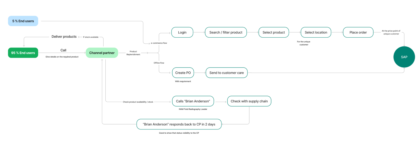
Mapping one common channel-partner scenario made the emotional highs and lows visible—from uncertainty during product discovery to greater confidence after guided checkout and transparent order tracking.
The journey linked customer emotion to specific design opportunities: clearer product routes, stronger comparison, guided configuration, a focused checkout and more transparent post-purchase support.
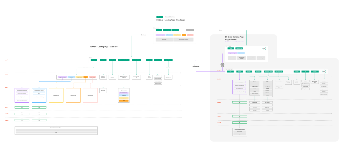
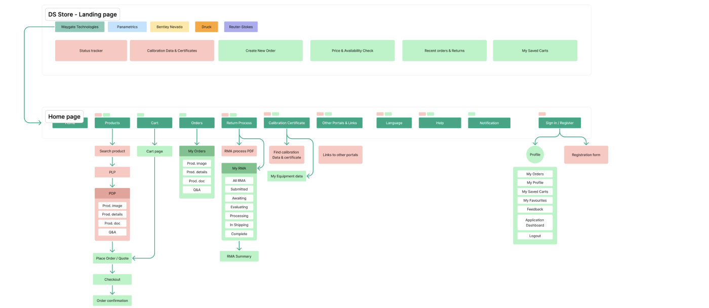
Detailed information architecture across guest and signed-in experiences.Simplified navigation and task hierarchy used by design and engineering.Wireframes tested workflow logic before visual design.
Product detail
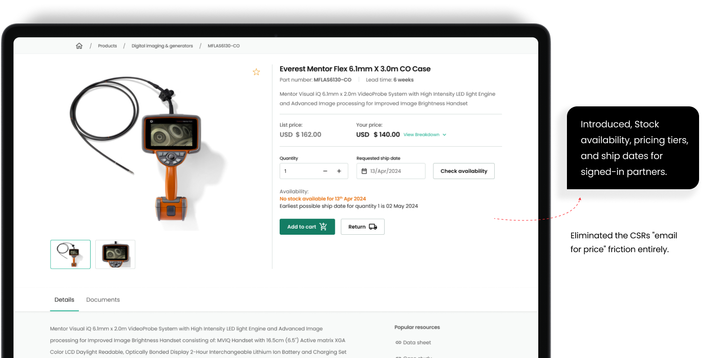
Put the information needed to decide up front.
Stock, tiered pricing, shipping dates and availability checks were surfaced at the point of decision.
Checkout
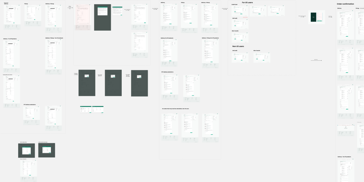
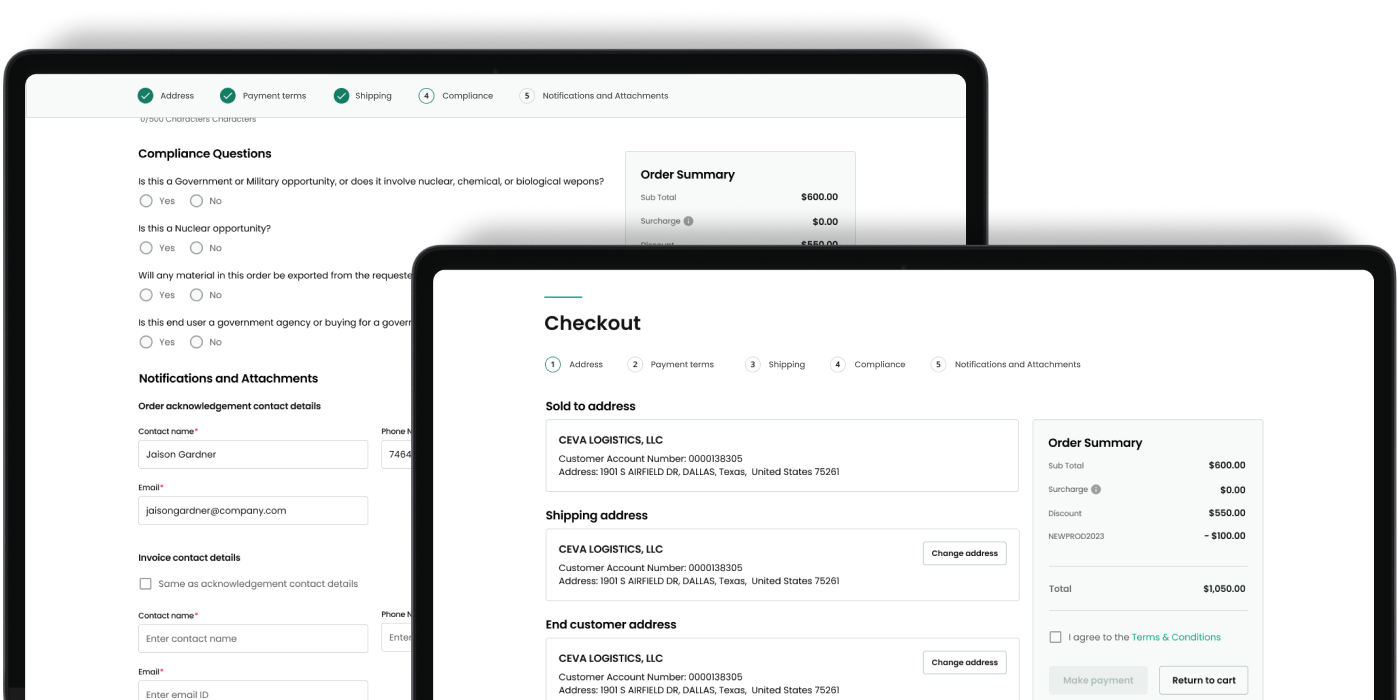
Guide customers through a focused five-step flow.
Progressive steps reduced cognitive load while preserving compliance, shipping and notification requirements.
Self-service
Make the signed-in experience useful at a glance.
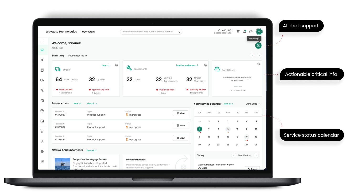
The dashboard brought together orders, quotes, equipment, service cases and upcoming activity, reducing the need to contact support.
Transparency
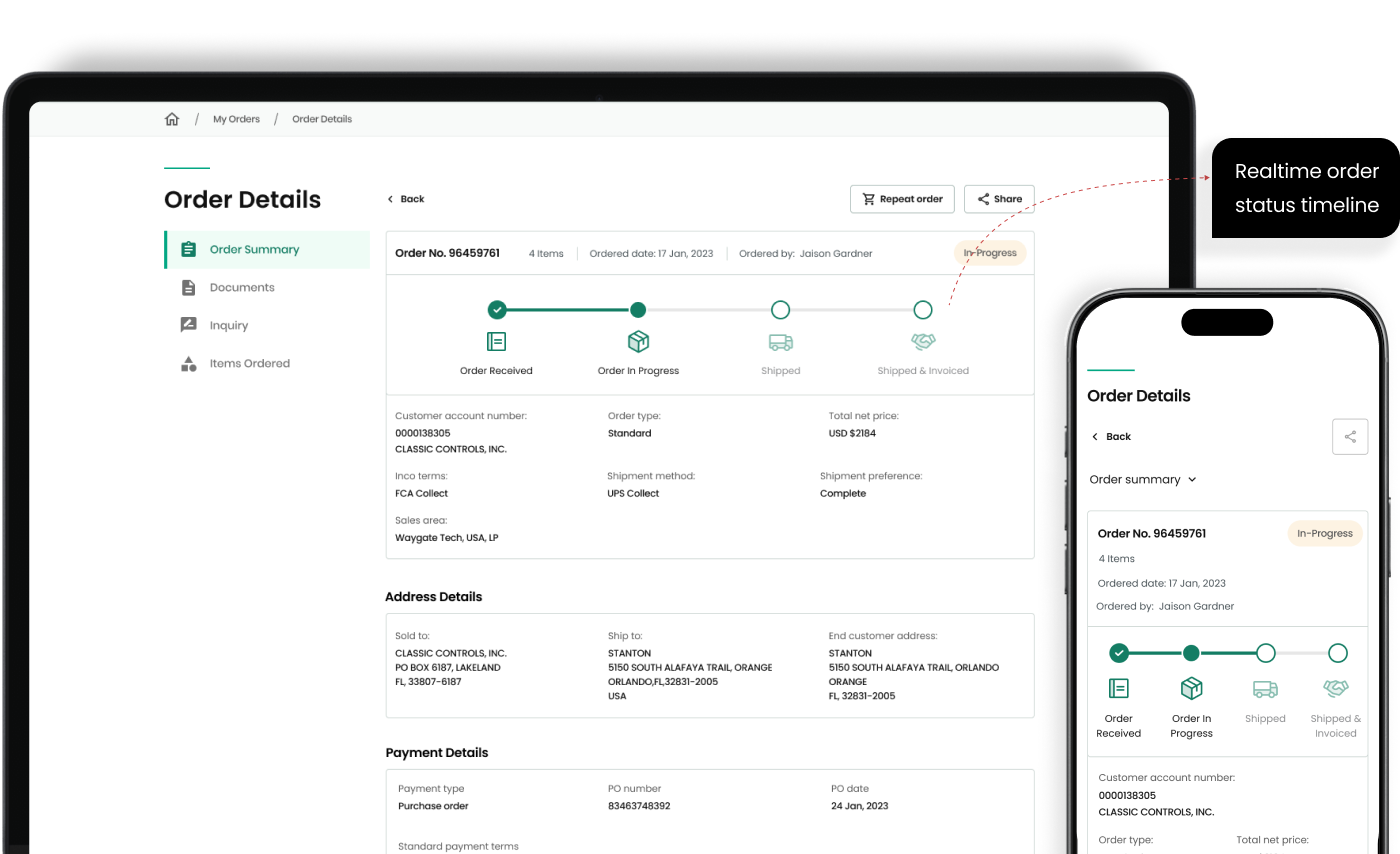
Give customers real-time order visibility.
Item-level status, delivery dates and repeat-order actions addressed one of the most common support enquiries.
Commercial outcome
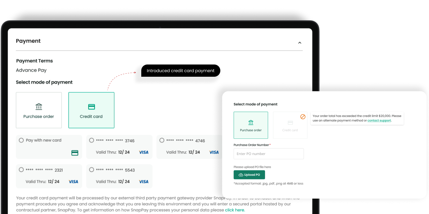
Introduce card payment within agreed limits.
A targeted discussion with product leadership helped unlock credit-card payments while respecting financial controls.
Design decisions and impact
From design decisions to delivered value.
These final sections make the collaboration, quality and outcome behind the screens easy to assess.
Working together
Product, engineering and business alignment
Worked closely with product managers, engineers, sales, customer care, channel teams and product specialists. Regular reviews helped resolve commercial and technical trade-offs early, while the shared design system kept implementation consistent.
Accessibility and quality
Designed into the delivery
Applied WCAG-informed patterns, clear hierarchy, progressive disclosure, predictable states and readable forms. Design QA focused on keyboard behaviour, validation, status messaging and responsive use across key journeys.
Results
Outcome delivered
The redesigned experience increased online sales by 68%, reduced checkout time by 54%, improved product search by 32% and reduced order-status enquiries by 43%.
Reflection
What I’d explore next
The strongest lesson was to treat commerce as a connected service rather than a set of screens. With more time, I would extend personalisation and proactive order communication while continuing to validate changes against support demand and conversion quality.