BH Design System
A federated central design system underpinning all digital products across Baker Hughes — enabling teams to build consistently and at scale.


BH Design System
The BH UI Toolkit is a central design system underpinning virtually all digital products across the Baker Hughes organisation, enabling design and development teams to build consistently and at scale.
Outcome
Problem & Challenges
The existing design system suffered from rigid component structures, inconsistent documentation, and a high barrier to adoption.
- Earlier version had an extensive growing backlog of unresolved GitHub issues
- Multiple project teams had already adopted version one and were experiencing friction
- Technical resource constraints limited the pace of improvement
- Third-party library dependencies created additional architectural constraints
Approach
Rather than discarding what existed, I chose to diagnose and repair the foundation first — conducting a thorough analysis of the existing design and code architecture before prescribing improvements.
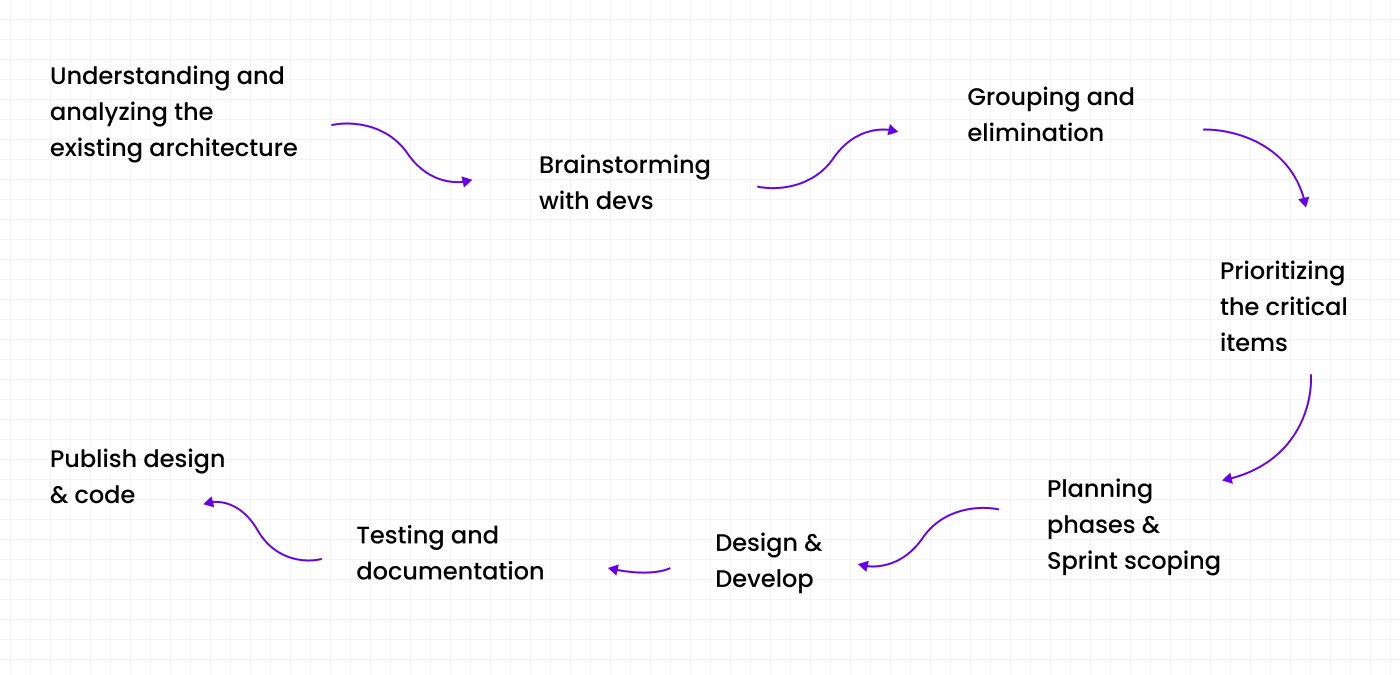
Federated Model
I initiated a federated model — embedding designers and developers from teams already using version one. A steering committee was established to align priorities and manage incoming change requests, significantly reducing the backlog.
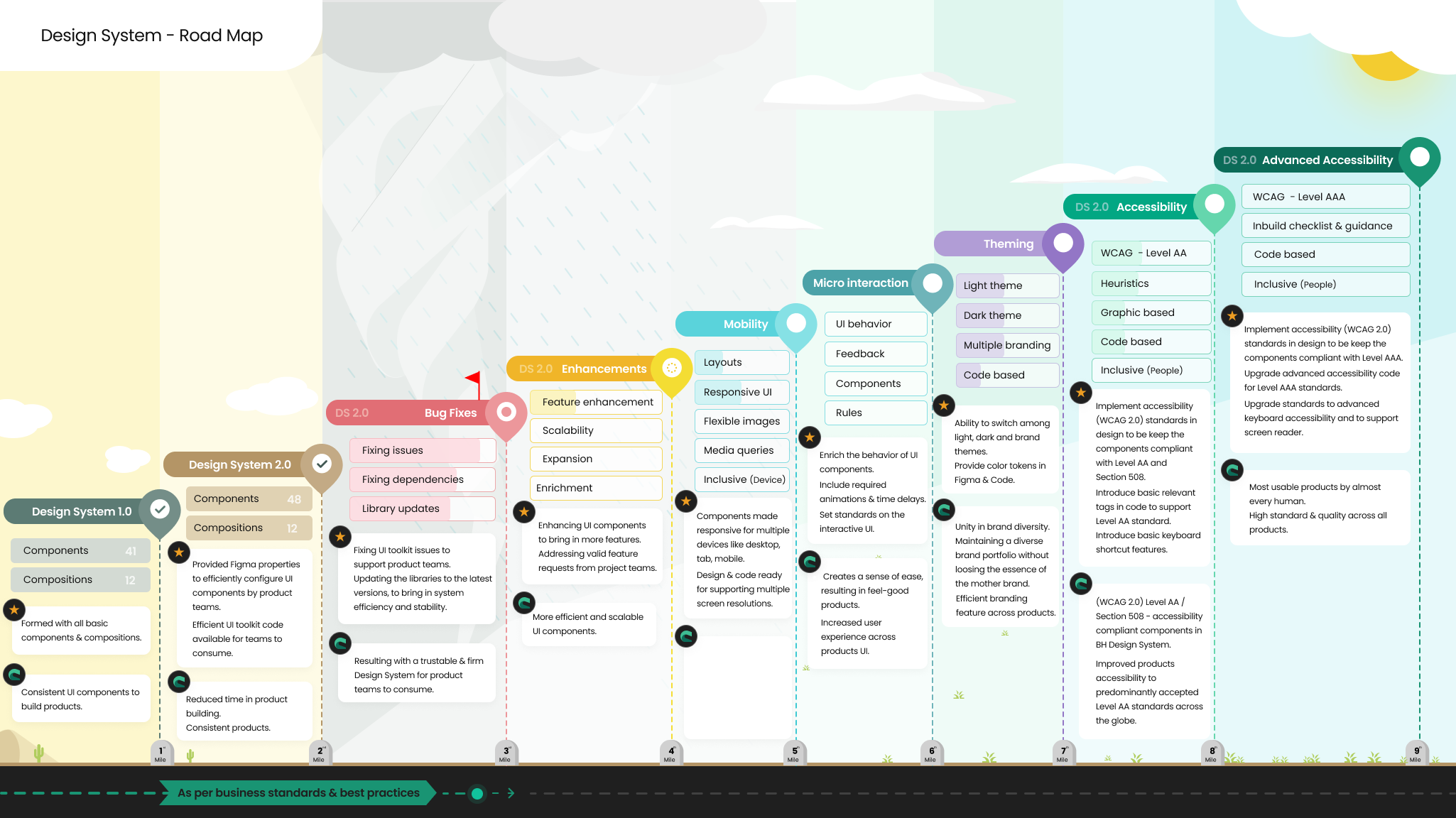
Roadmap & Milestones
A structured roadmap was developed to clearly communicate the current state, prioritised actions, and target outcomes across the organisation.
Three-Tier Architecture
A three-tier architecture with Atomic Design approach was adopted to support multi-product, multi-brand scalability with clear separation at token, component, and pattern levels.
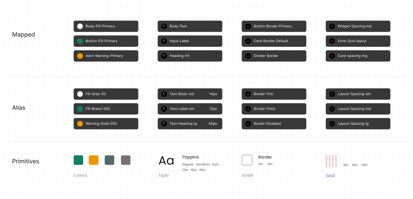
Atomic Design Review
- Tokenisation of design decisions
- Component structure and prop management
- Accessibility compliance (WCAG)
- Rendering and load performance
- Micro-interaction fidelity
- Clear and actionable documentation
Foundation & Components
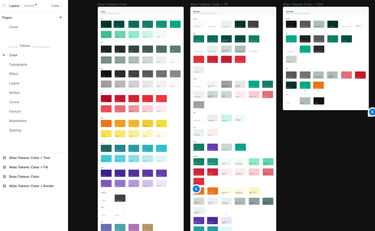
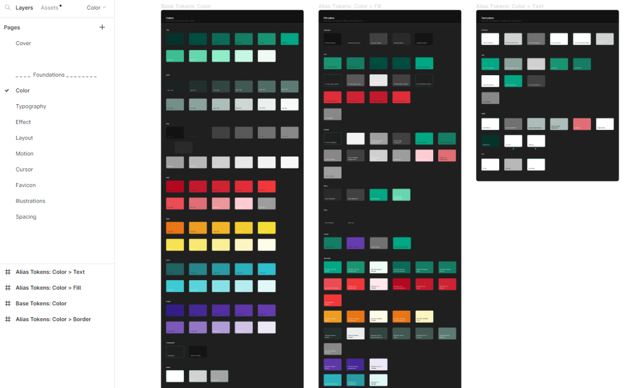
Colour System
The colour palette was comprehensively upgraded with full tint/shade ranges, semantic alert states, data visualisation colours, and foundational tokens supporting multi-project needs.
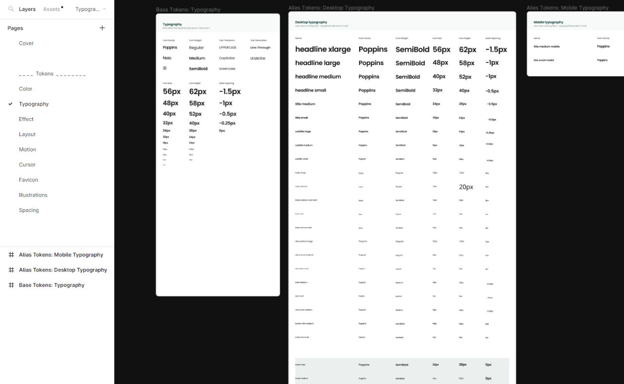
Typography
Typography defined to support responsive screens with a clear visual hierarchy across all breakpoints.
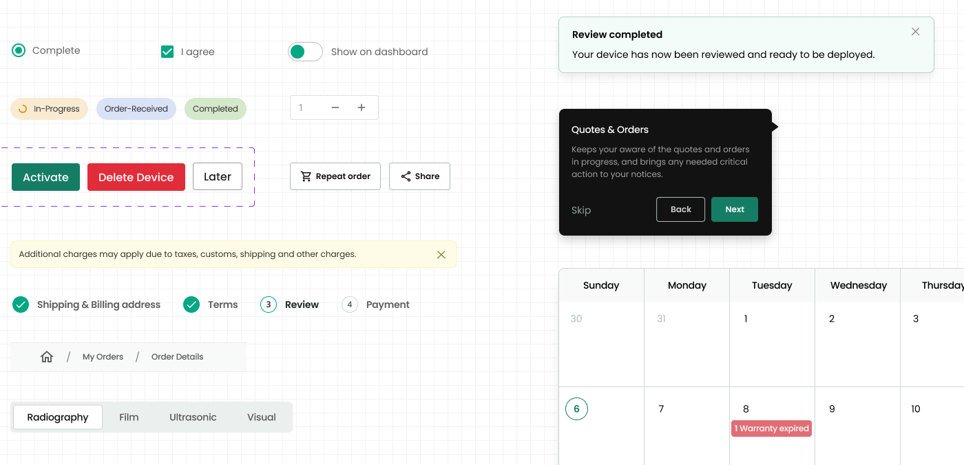
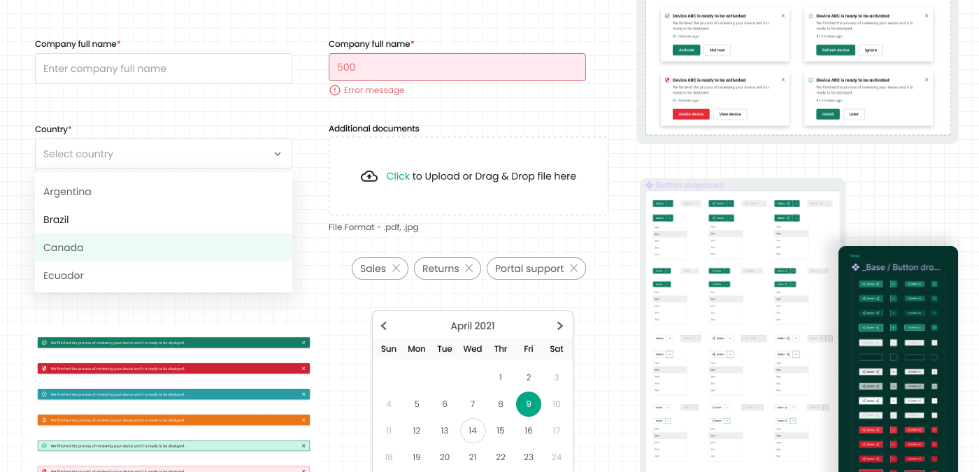
Component Library
Components built aligned to brand standards and accessibility requirements. Existing base components were upgraded iteratively — rather than replaced — to avoid disrupting live projects.
Documentation
Zeroheight served as the single source of truth. Every sprint produced updated component documentation including usage guidelines and "Dos and Don'ts". Release notes communicated via email and maintained in GitHub.
Let's build something meaningful together.
Open to discussing new opportunities, design challenges, and collaborations.