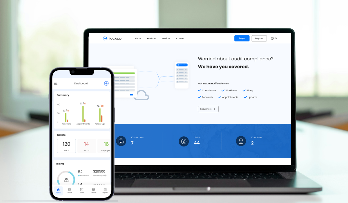
Making complex compliance work feel clear and manageable.
A responsive platform designed to help teams track obligations, actions and financial information with confidence.
Role
UI/UX Designer
Period
2024
Scope
Research, product design and UI system
At a glance
A compliance platform designed to help teams identify missing information, prioritise work and complete dense regulatory tasks with greater confidence.
Problem
Compliance users had to interpret large amounts of business data, understand what was incomplete and decide what to address first. Dense screens and inconsistent patterns increased cognitive load and reduced trust.
My contribution
I designed the information hierarchy, status-led dashboard and reusable patterns for complex compliance tasks. I worked with stakeholders to prioritise the most important user decisions and with delivery partners to keep the responsive experience practical and consistent.
What made it complex
Data-heavy enterprise workflows
High need for accuracy and auditability
Responsive use across desktop and mobile
Multiple states, permissions and completion rules
Problem → response → value
Compliance SaaS: turning complexity into clear decisions
Users needed to understand priorities and complete regulatory tasks without losing important detail.
User / team problem
Why it mattered
Design response
Value / evidence
Unclear priorities
Dense compliance information made urgent tasks hard to identify.
Designed a status-led dashboard and prioritised next actions.
Faster identification of work is the intended benefit; not independently measured.
Heavy forms
Long data-entry flows increased cognitive load.
Grouped related fields and applied progressive disclosure.
Easier review and completion; qualitative intended benefit.
Uncertain ownership and progress
Teams lacked clear completion states and next steps.
Introduced stronger status hierarchy, ownership and completion cues.
Detailed desktop data needed to remain usable on mobile.
Applied responsive layouts and context-appropriate interaction patterns.
More consistent multi-device usability.
Trust in assisted decisions
Automation or AI assistance can be misleading when rationale is unclear.
Proposed transparent recommendations and explicit human decision points as an AI design direction.
Future design opportunity only; not a verified shipped AI feature.
Detailed case study
Design challenge
Balance trust, depth and day-to-day usability.
Users wanted the simplicity of modern fintech tools without losing the depth required for compliance and operations.
I focused on progressive disclosure, clear system status and consistent transaction patterns.
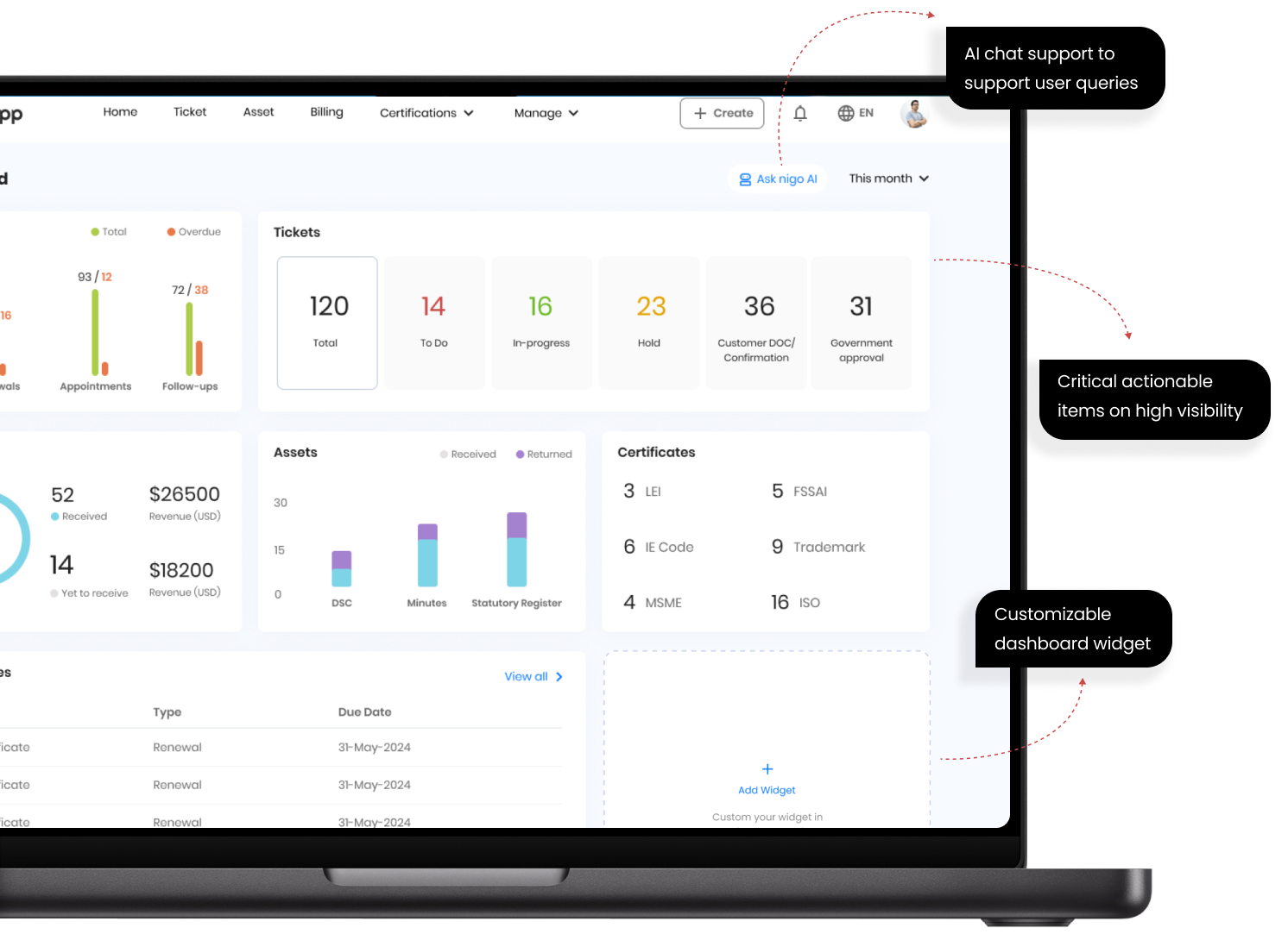
Dashboard
Put urgent work and useful status first.
High-priority actions, tickets, certificates and customisable widgets were designed for fast scanning. AI support was positioned as assistance rather than a replacement for judgement.
Responsive experience
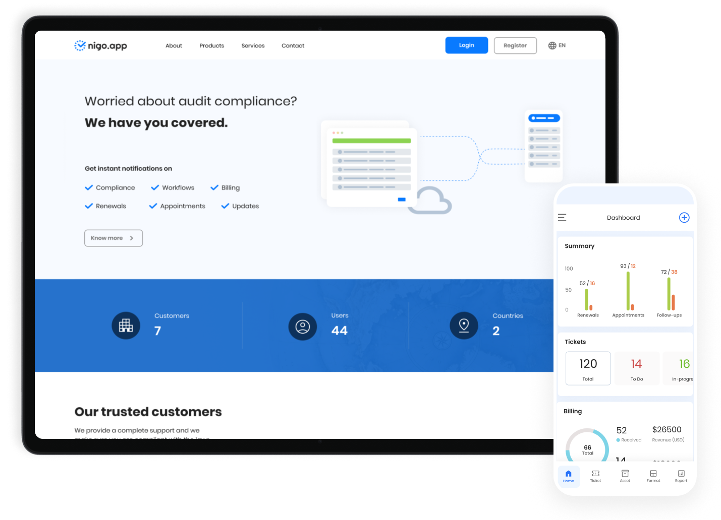
Keep the product coherent across web and mobile.
Shared hierarchy and responsive patterns supported quick checks on mobile and deeper operational tasks on desktop.
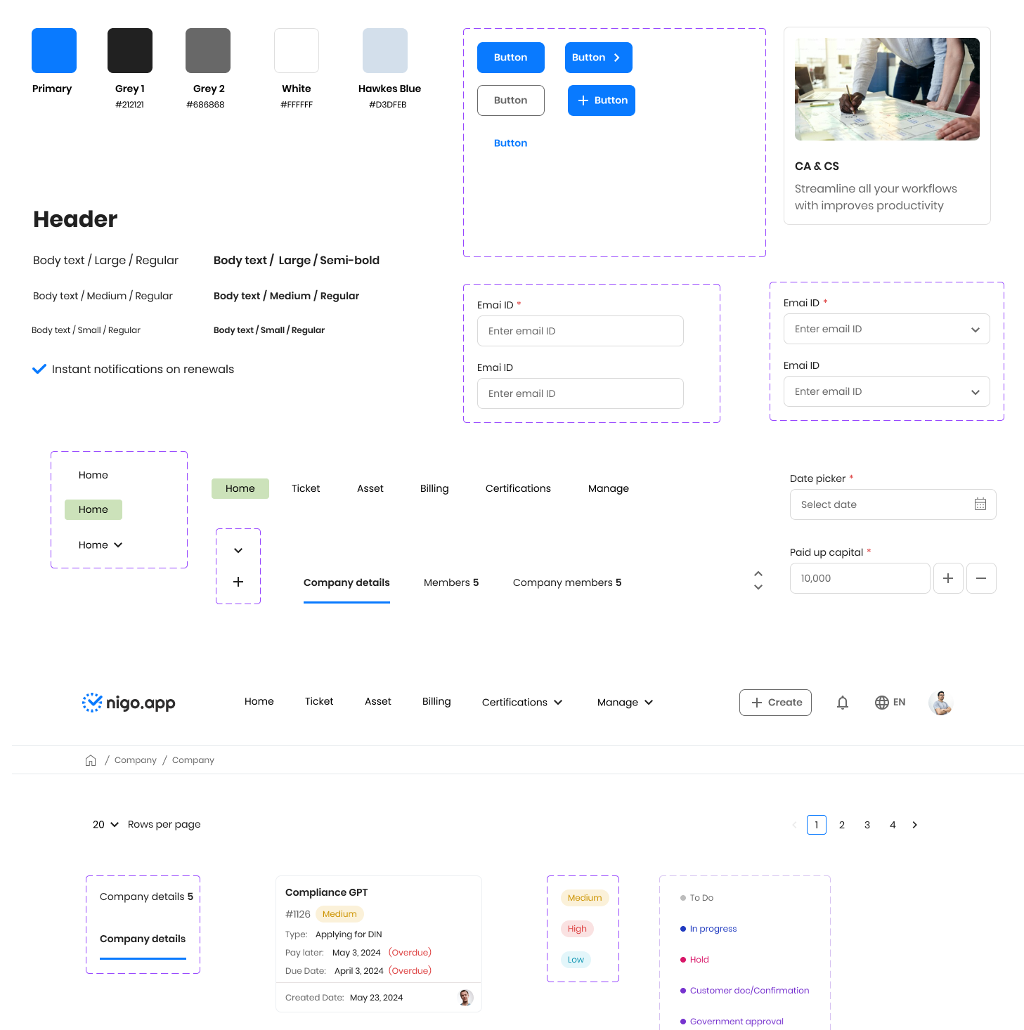
Visual system
Build trust through consistency and restraint.
A focused palette, readable typography and predictable form patterns created a calm experience for complex information.
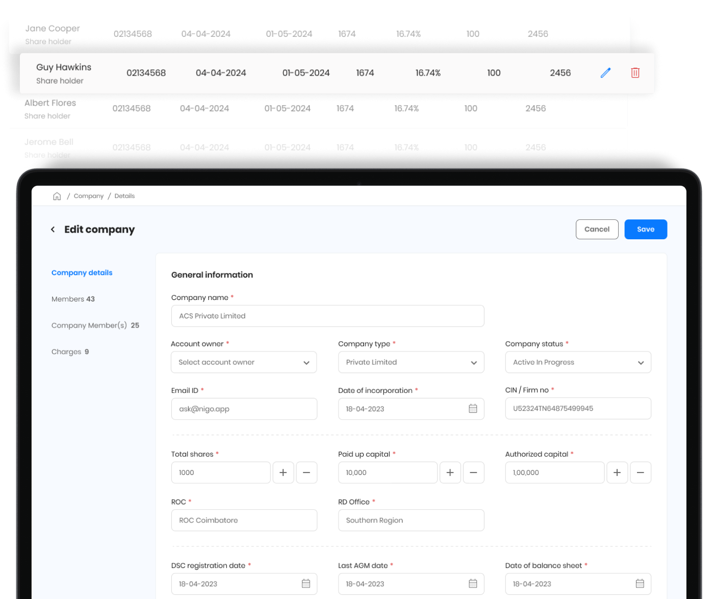
Complex forms
Structure dense business data into manageable sections.
Tabs, grouped fields, inline controls and clear save actions reduced the effort of managing detailed company and shareholder information.
Design decisions and impact
From design decisions to delivered value.
These final sections make the collaboration, quality and outcome behind the screens easy to assess.
Working together
Product, engineering and business alignment
Worked alongside product, engineering and business stakeholders to translate compliance requirements into understandable tasks. Reviews focused on the meaning of status, priority, ownership and completion—not only screen layout.
Accessibility and quality
Designed into the delivery
Strengthened contrast, content hierarchy, form structure, status communication and responsive readability. Reusable patterns reduced variation and supported more predictable keyboard and screen-reader experiences.
Results
Outcome delivered
The solution brought urgent work, progress and detailed business information into a coherent experience, giving teams a clearer path through complex compliance activity.
Reflection
What I’d explore next
The project showed that trust comes from consistency and transparent status. Further work would measure time-to-completion, error recovery and the usefulness of proactive guidance across different user roles.