Stealth(identity)™
Leading UX across three major releases of a biometric identity platform — replacing passwords with fingerprint, face, iris, voice, and behavioural biometrics.


Stealth(identity)™
Passwords get forgotten, stolen, or spoofed. Stealth(identity) replaces them with something more reliable — fingerprint, face, iris, voice, and behavioural biometrics. I led the UX across the platform's three major releases, turning a system built for field security officials into one designed for the people using it every day.
Outcome
Objective & Ownership
Improve the usability of the biometric SaaS platform by introducing clear task hierarchy and streamlined workflows to reduce cognitive load and improve operational efficiency.
My Ownership
- End-to-end UX across administrator console, enrollment flows, and authentication interfaces
- Design system creation and governance across the Stealth(identity) product family
- User research, usability testing, and WCAG AA accessibility compliance
- Cross-functional collaboration with engineering, product, and security teams
Research & Discovery
Identity management software sits at the intersection of security, compliance, and usability — a particularly difficult design space where the people implementing the system are not the same people experiencing it day-to-day. I ran structured research sessions across three distinct user types before drawing any design conclusions.
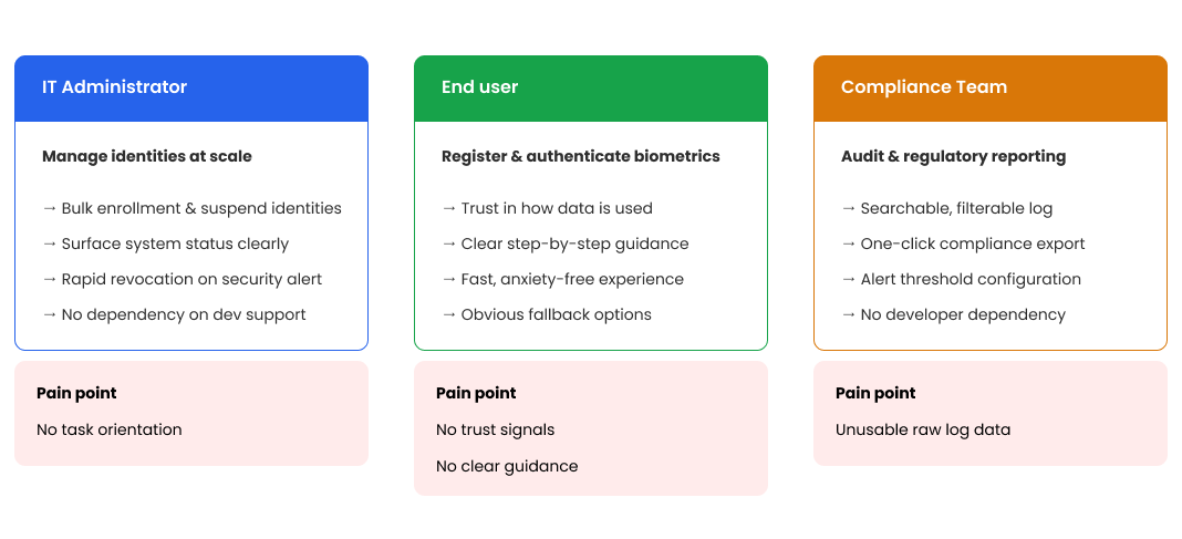
Key Research Findings
- Admin console had no visual hierarchy, no task orientation, no status communication — felt like a spreadsheet
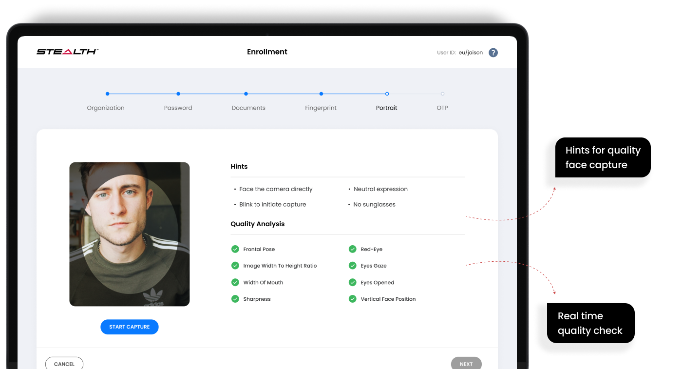
- Enrollment operators had no real-time quality feedback — submitted blind, waited for server, received pass/fail with minimal context
- End users felt anxious about biometric capture — no context about what was happening or why
- Multiple biometric modalities had completely inconsistent interfaces built by different teams at different times
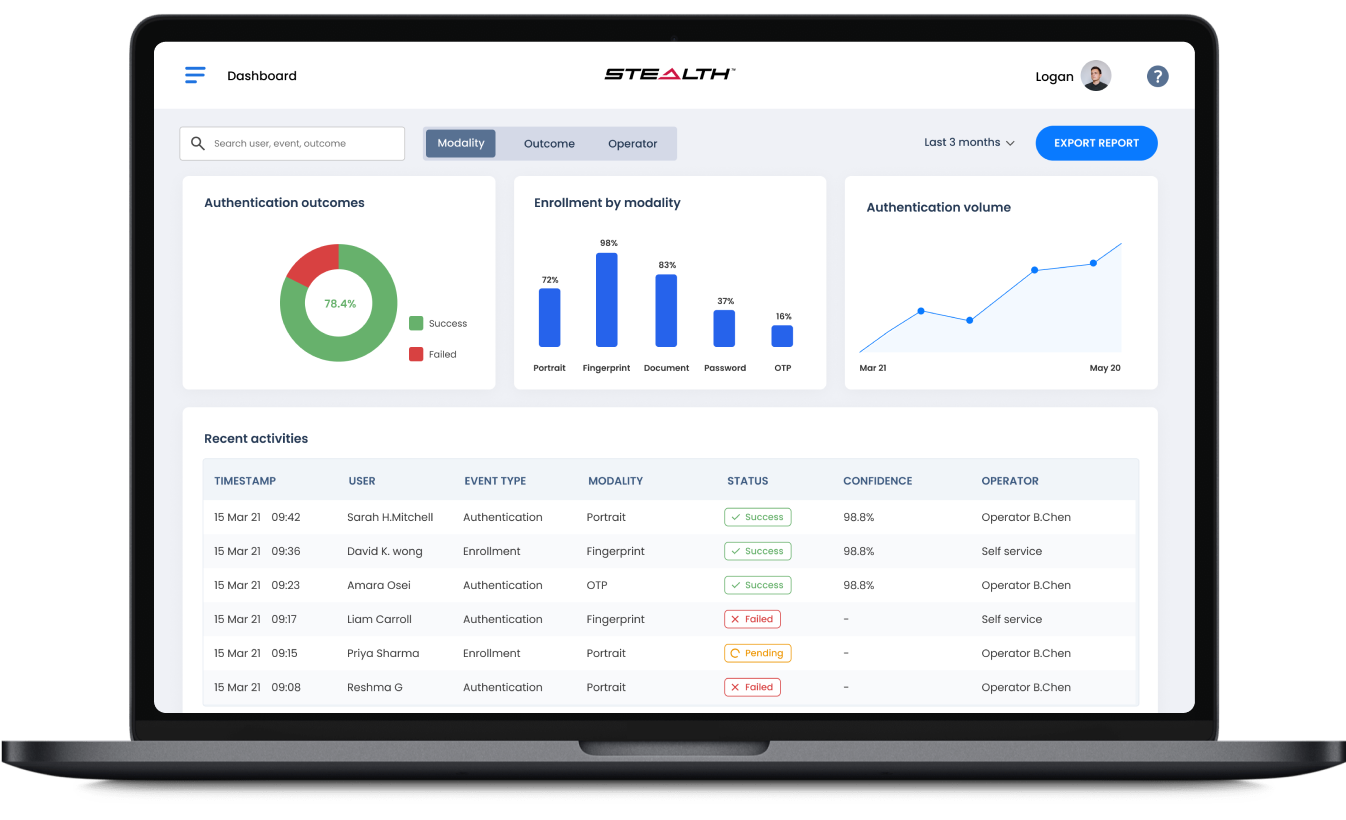
- The audit log was technically complete but practically unusable — unfiltered raw transaction data
- Mobile SDK offered no design system — every enterprise integration created a completely different user experience
Information Architecture
Problem Definition
The admin console was a database query interface dressed up as a management tool. Administrators were fighting the interface instead of doing their jobs.
Problem 1 — Admin Console: No Task Orientation
The existing console presented all data, all the time, with no hierarchy. An administrator managing 10,000 enrolled identities had no way to surface what required attention, what was pending, or what had failed.
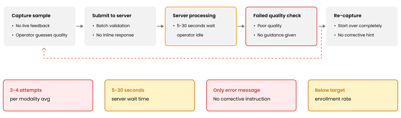
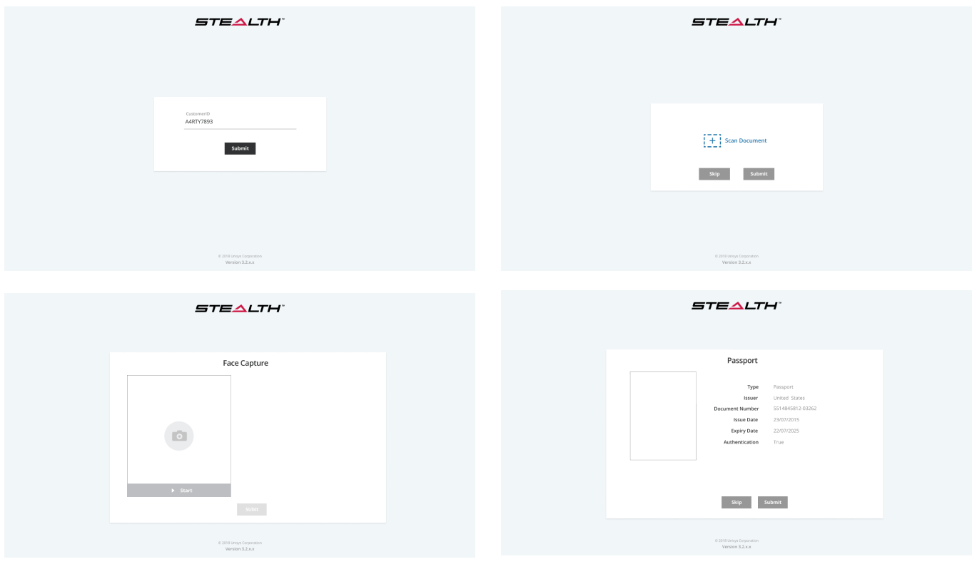
Problem 2 — Enrollment Flow: No Real-Time Feedback
Biometric capture quality is critical — a poor-quality fingerprint scan creates a weak identity that fails authentication later. Enrollment operators had no inline quality indicators during capture. Enrollment rates were significantly below business targets.
Problem 3 — Authentication: No Trust Architecture
For the person being authenticated, the moment of biometric capture was completely opaque — no explanation of what was being captured, no indication of progress, no confirmation of success.
Problem 4 — Multi-Modality Inconsistency
Face recognition, fingerprint, iris, voice, and behavioural biometrics each had separate UIs built by separate teams at different times. The compliance audit log was a flat, unsorted, unsearchable table of raw transaction data.
Design Process & Solution
Old Design
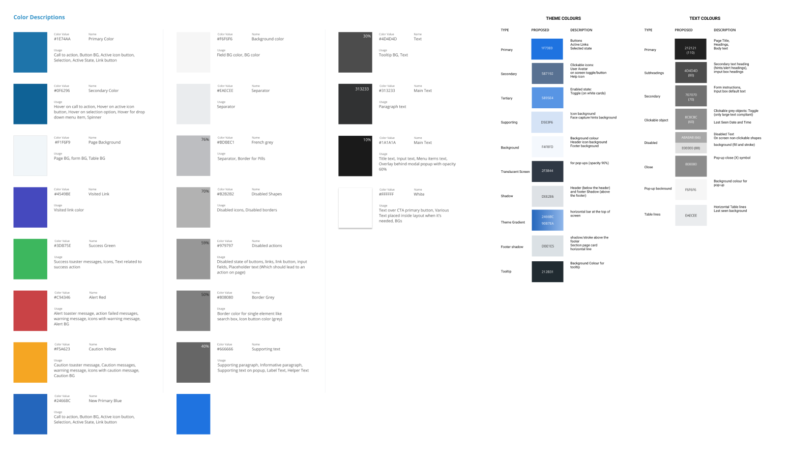
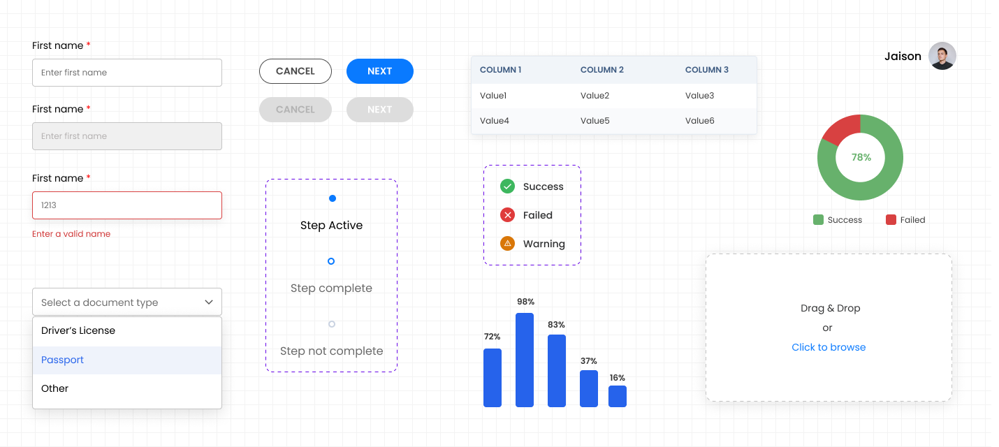
Unified Design System
One of the most impactful deliverables was establishing a unified component library across all biometric modalities and platform surfaces.
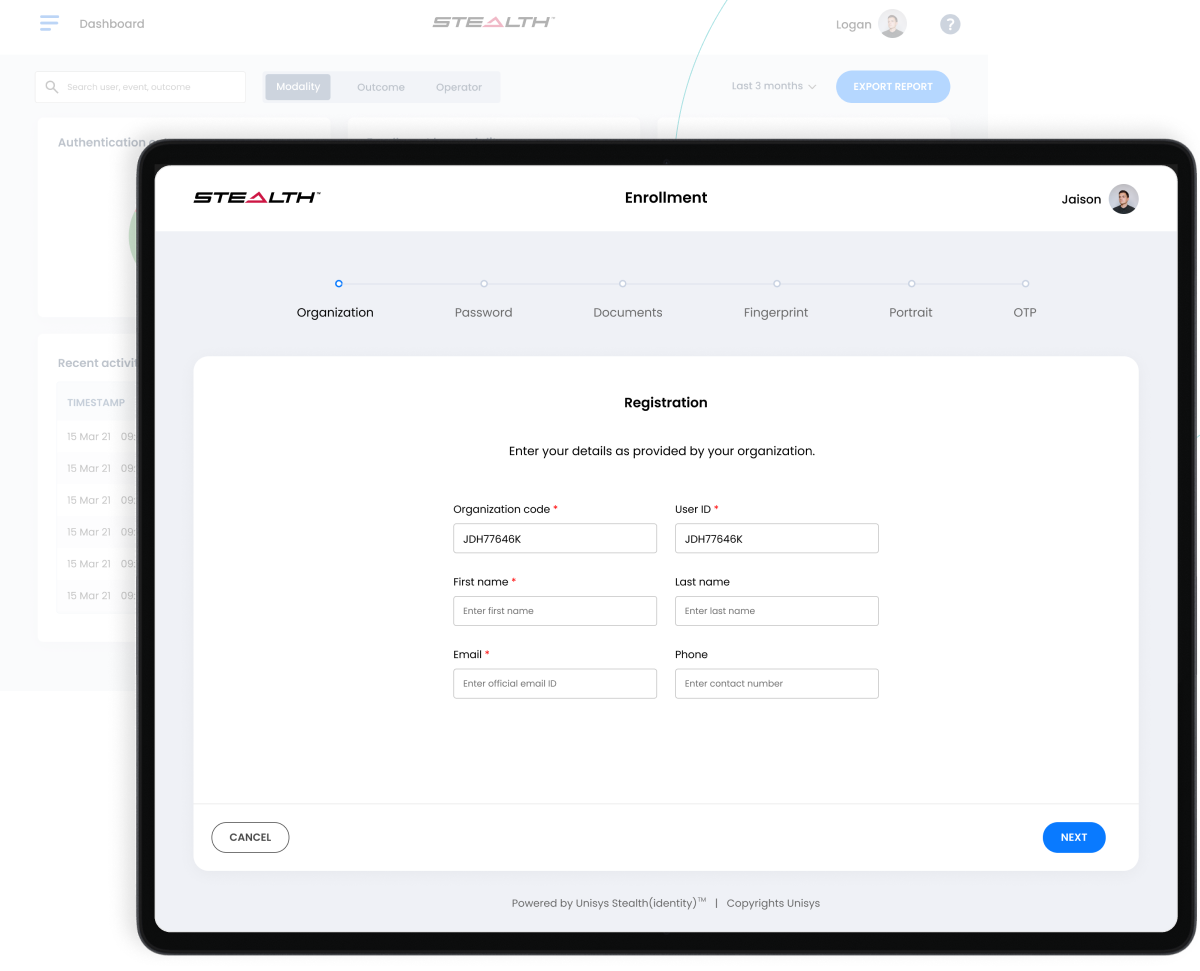
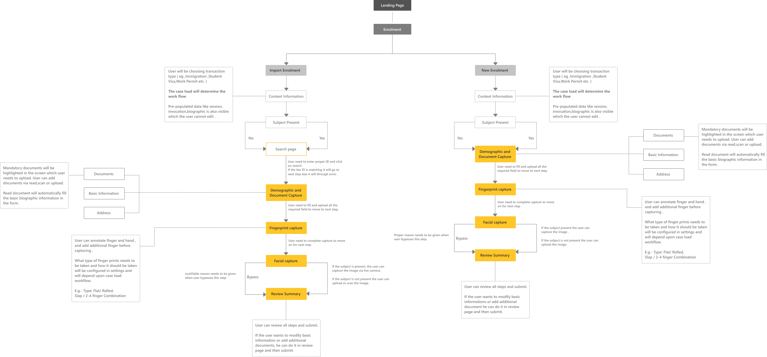
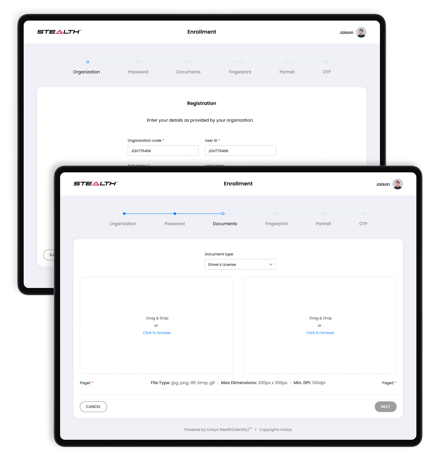
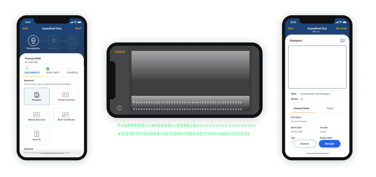
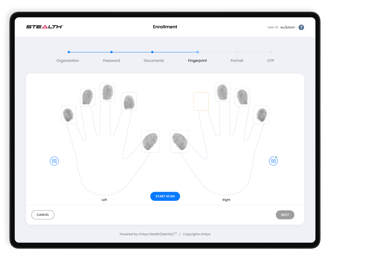
New Design - Biometric Enrollment Wizard
Simplified steps with clear progress and focus.
Admin Console Redesign
The console was rebuilt from the administrator's actual workflow outward. The home dashboard now surfaces actionable status immediately — enrollments pending, authentications failed in the last 24 hours, system health, and alerts requiring action.
Let's build something meaningful together.
Open to discussing new opportunities, design challenges, and collaborations.