Replacing a costly tool with a clearer in-house experience.
A reusable configuration module designed for complex industrial products across commerce and internal platforms.
Role
Lead UX Designer
Period
2025
Scope
Discovery, UX and scalable UI
At a glance
An in-house product configurator that replaced costly third-party dependency while protecting the mental model of experienced users.
Problem
The existing tool was expensive to maintain and disconnected from the wider product experience. Users needed to make many technical choices without losing product context, price visibility or saved progress.
My contribution
I led UX discovery and mapped the configuration journey, then designed the interaction patterns and prototypes for complex product choices. I worked with product and engineering partners to balance user familiarity, technical feasibility and the move to an in-house solution.
What made it complex
Technically detailed products and dependencies
Multiple entry points and repeat-user workflows
Migration from a familiar external tool
Responsive behaviour and saved configurations
Problem → response → value
Product Configurator: commercial trade-offs and user continuity
The business needed to reduce external-tool dependency without disrupting experienced users.
User / team problem
Why it mattered
Design response
Value / evidence
Complex configuration decisions
Users faced many technical options with unclear dependencies.
Structured choices, searchable navigation and progressive guidance.
Portfolio reports 27% faster configuration.
Loss of product and price context
Users struggled to see the consequences of selections.
Kept the configuration summary and relevant context visible.
More informed decisions and fewer avoidable changes.
Interrupted work
Users needed to return to a partially completed configuration.
Designed saved and editable configurations and return paths.
Better continuity for repeat users; qualitative benefit.
Costly disconnected tooling
Third-party dependence constrained integration and increased cost.
Designed a reusable in-house module that fit the wider buying journey.
Reduced external dependency; confirm whether 84% and 86% refer to different measures.
Measurable outcomes
Outcomes at a glance.
The clearest customer, delivery and business outcomes from the work.
86%increase in cost efficiency
27%reduction in configuration time
22%improvement in performance
1reusable SaaS module
Detailed case study
Objective
Improve the experience without breaking users’ existing mental model.
The third-party tool was expensive, slow and difficult on mobile, yet experienced users were familiar with its structure.
I balanced continuity with meaningful improvements in navigation, feedback, speed and responsive behaviour.
Discovery
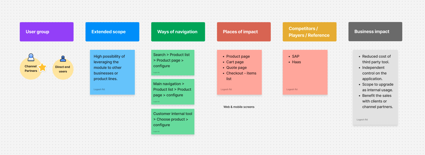
Align scope, users, entry points and business impact.
Stakeholder workshops clarified where configuration appeared, who used it and how replacing the vendor would affect cost and ownership.
User needs
Keep repeat users productive.
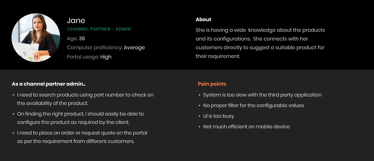
The primary channel-partner persona needed faster filtering, less visual noise and an experience that worked properly on mobile.
Flow
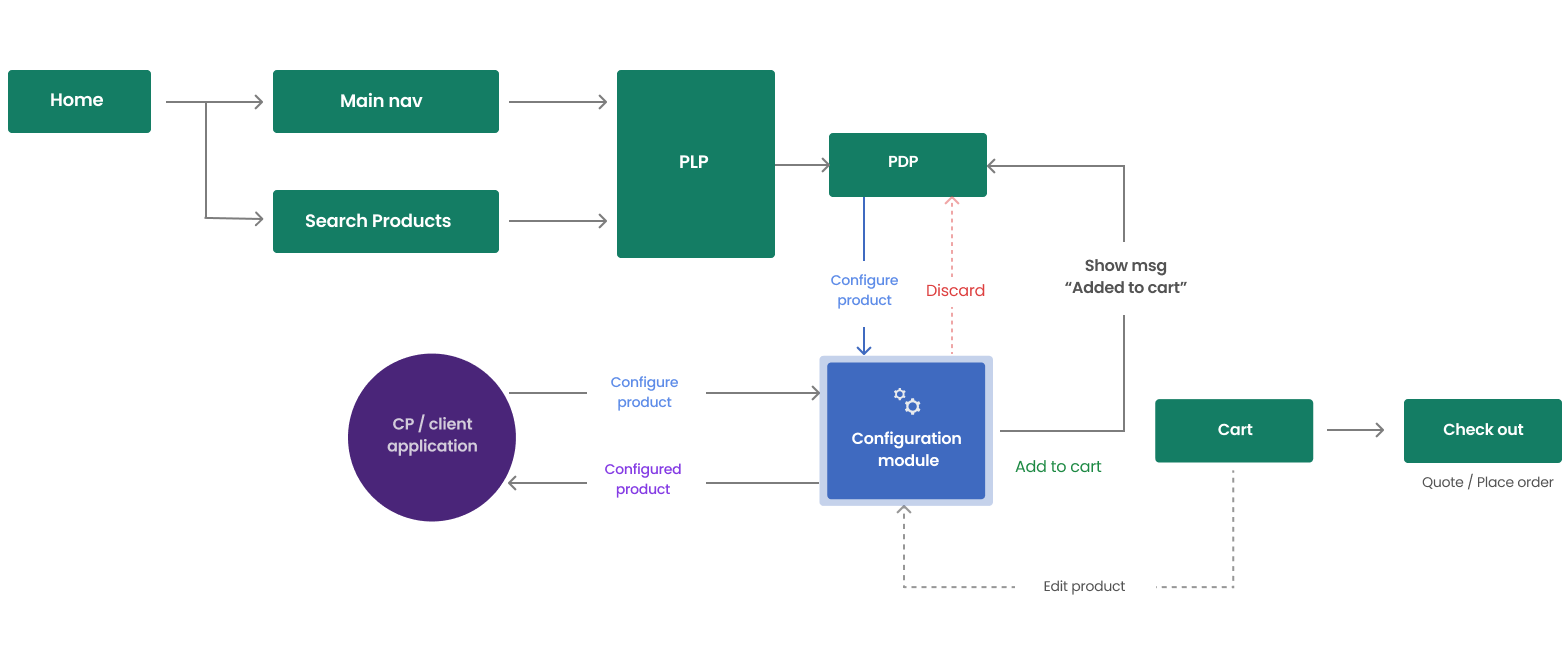
Design the module to work across multiple entry points.
The flow supported product listing, product detail, client applications, cart updates and editing without tying the configurator to one platform.
Entry point
Make configuration intent clear before users start.
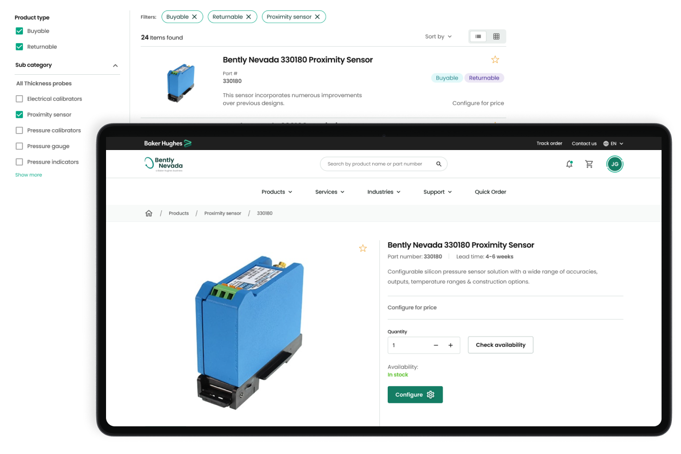
Product listing and detail screens communicated when configuration was required and set expectations around pricing.
Core experience
Keep decisions, price and product context together.
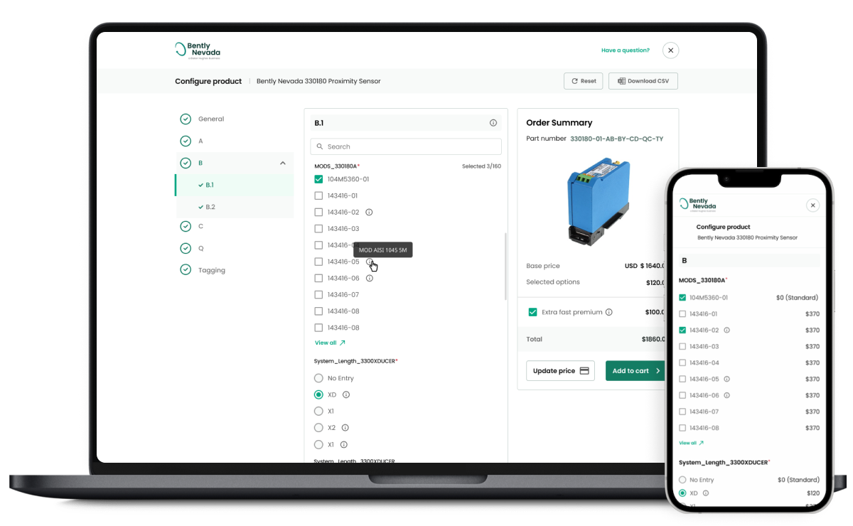
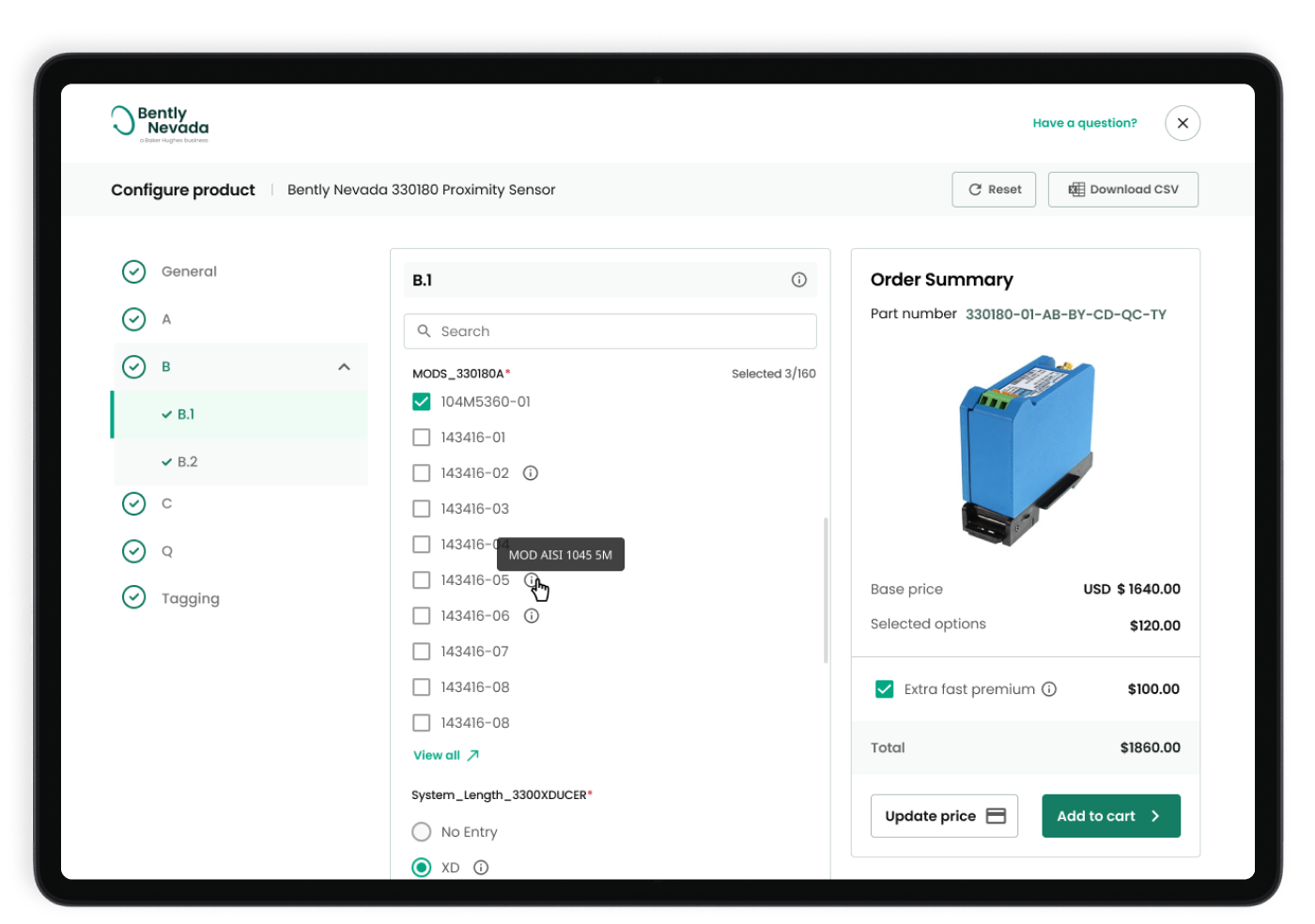
A left-hand structure, searchable options and a persistent order summary reduced navigation effort and supported confidence.
Responsive editing
Let users return without losing their work.
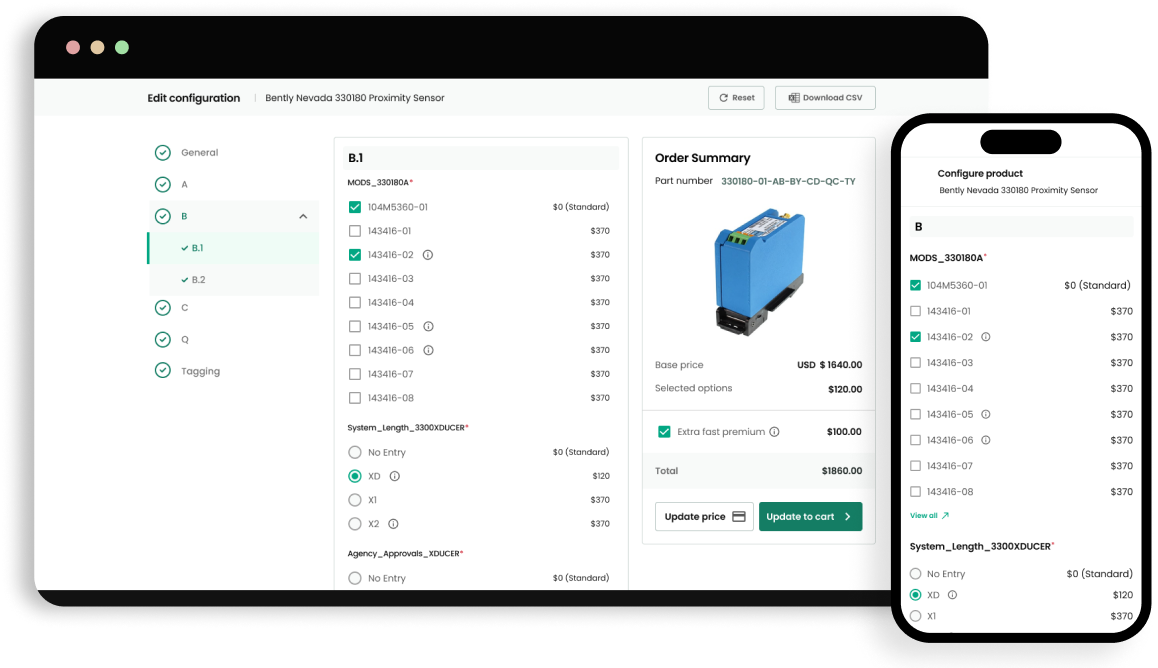
Previous selections were pre-populated and editable across desktop and mobile, supporting common repeat-order tasks.
Design decisions and impact
From design decisions to delivered value.
These final sections make the collaboration, quality and outcome behind the screens easy to assess.
Working together
Product, engineering and business alignment
Partnered with product managers, technical specialists and engineers to balance configurability with a clear interaction model. Early prototypes helped confirm scope and reduce implementation risk.
Accessibility and quality
Designed into the delivery
Used clear grouping, progressive disclosure, consistent selection states, readable summaries and keyboard-friendly controls. The responsive design preserved context and decision visibility at smaller screen sizes.
Results
Outcome delivered
The new experience reduced third-party dependency, created a reusable internal capability and made complex product decisions easier to review, save and continue.
Reflection
What I’d explore next
The central design challenge was supporting expertise without overwhelming less frequent users. A future iteration would add smarter recommendations and compare-mode support based on validated customer needs.